Plotting Website Loads with HAR and gnuplot
It’s super useful to analyze the performance of websites and there are some great tools out there like Google PageSpeed Insignts and WebPageTest. One shortfall is they do not let you customize the output much, and I would really like to be able to create a nice waterfall diagram. HAR steps in as a format standard for capturing and exporting HTTP network data and opens the door to do-it-yourself diagram plotting.
Generating a HAR archive
Exporting to HAR format is built-in for Chrome. As explained here, from the Network tab under Developer tools you can simply right-click and export the current HTTP network data as HAR.
Firefox needs an extension to handle exporting to HAR; NetExport was recommended but the project looks abandoned now and isn’t available as a Firefox Add-On.
Plotting with gnuplot
Among the collection of projects related to HAR is har2gnuplot. It’s a handy tool that creates a waterfall plot in gnuplot and saves the result as a PNG image.
To get the project up and running on Ubuntu:
$ git clone git@github.com:fh-salzburg/har2gnuplot.git
$ sudo apt install -y nodejs gnuplot
$ npm install underscore module cli
Now, after copying a .har file into the project directory and running make, a PNG
and .gnu file will be generated. After some tweaks with the axes and legend, I got:
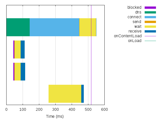
Aside from the missing URIs, this image would be perfect to drop into a document or website to visualize resource load times.
Maybe if I have some time I’ll work on a har2gnuplot clone in Python with haralyzer and gnuplot-py to add URI labels and learn more about gnuplot.